Oli Yeates · 26 May 2026
clicky. earned the right to be just clicky.
Year 20 starts with a brand update. The bullseye target is coming off the clicky logo and the wordmark is doing all the work on its own. A note from me on why subtraction is the most natural step we could take.
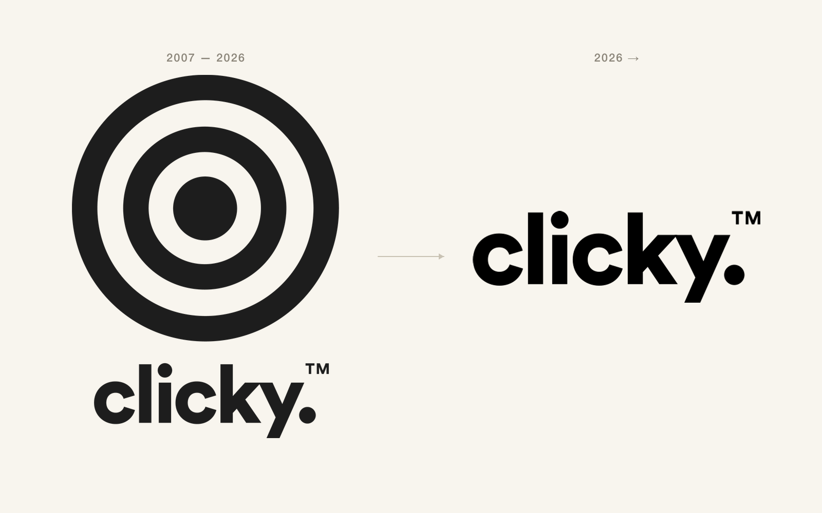
When we registered clicky in 2007, we needed a logo before we needed a second client. The bullseye landed inside a couple of evenings. A target. The thing you aim at. The thing you hit when the work is honest. It went onto the first business cards I printed, the back of every laptop that came through the office, and eventually onto the wall in Chester. Nineteen years on, it has run its lap.
Starting our 20th year, we're dropping the target from the logo. The wordmark stays. The full stop stays. The bullseye goes.
Why now
A logo is a signal of what a brand is, told in the simplest visual language it can manage. In 2007 the target said something the word "clicky" could not. We were a new business asking strangers to trust us with their growth budgets, and the bullseye was shorthand for "we know what we're aiming at." It earned its keep for nearly two decades.
In 2026 it is redundant. After 19 years of campaigns, awards, partnerships and clients who came back and brought their friends, the word "clicky" carries that meaning on its own. The target had become scaffolding around the brand. The building is up now.
The principle of subtraction
Every brand I admire has, at some point in its life, taken something away. The ones that lasted got simpler as they got older, not louder. You earn the right to do less. You don't earn the right to do more.
Year 20 felt like the right moment to do the subtraction. We have spent a decade and a half adding. Adding people, services, partnerships, offices, awards. The brand identity was the one corner of the company that had stayed unchanged since the back-bedroom days, and it had quietly drifted from "founding mark" to "a thing we explain on every new pitch deck."
When you find yourself explaining your logo, the logo is doing too much.
What the wordmark already does
"clicky." in the new lockup is the brand. The lowercase is friendly and direct, which is how we want clients to feel when they pick up the phone to us. The full stop is a flat, declarative thing. It is the sound of a decision being made. It is the click. The bullseye was never doing anything the wordmark couldn't do on its own. It was just doing it loudly.
There is a TM mark sitting next to the full stop because clicky is, and has been for a long time, a trademark we have defended. Quietly. With paperwork.
Practical wins
Removing the target unlocks a list of wins we have been working around for years.
The wordmark sits cleanly inside a 16-pixel favicon. The old stacked mark crushed at that size and ended up looking like a smudge. It also sits cleanly on a single line in a website header, which the stacked target-plus-wordmark never did without help.
It survives in a single colour, on dark, on light, in stitched merch, debossed on a business card, in motion graphics, and in the corner of a partner badge. The target was a beautiful object but it had a thick-and-thin contrast that needed a certain print quality to read properly. The wordmark does not need anyone to print it carefully.
It also sits comfortably alongside the other brands in the Clicky Group. AmplifyAds, Sprint Studio and the rest of the group's product brands all run lowercase, type-led marks. Putting a target above the parent brand made the lockup feel older than its children. Now they all sit on the same shelf.
The rest of the refresh
The logo change is the headline, but year 20's brand work is broader than that. The colour palette is being tightened so it carries from clicky.co.uk through to client decks, social, signage and merch without anyone having to ask which blue we mean. The type system is being simplified. The illustration style is being given a single set of rules so a graphic from one team looks like it could have come from another. None of it is showy. All of it is overdue.
You will see the full refresh roll out across clicky.co.uk, our client work, our office and our recruitment over the coming months. The site you are reading this on already runs the new wordmark in the header.
Thank you to the target
The target shipped with us through three offices in Chester, through Nottingham, through Manchester, through every shortlist, every late submission, every award, every client win, every team photo. It was a good logo. It got us here. Saying goodbye to it is not a casual decision. It just isn't the right thing to keep carrying into the next decade of the company.
Year 20 is going to be the biggest investment year we have ever signed off on. A new lockup that gets out of the way is a sensible place to begin.
19 years done. Year 20 starts now. Cleaner.
With thanks,
Oli