


We're passionate about who we are. What we do. How we behave. The way we interact with each other. We wanted to create a digital agency people would want to work for & with.
We think we've made it.


services
Creating digital success stories since 2007.
Our founding aim, ethos, and what motivates everything we do, is transforming ambitious brands through world-class, results-driven digital strategies, tied to long-term commercial success.
We work with businesses committed to growth who need effective solutions and a trusted partner to drive positive change, commercial performance and to maximise their digital potential.
Everything we do is tailored to your needs and goals, because we believe your success is our reward.


people & Planet
We take our commitment to people & planet seriously.
In 2021, Clicky became a B Corp.
B Corp is the nonprofit network transforming the global economy to benefit all people, communities, and the planet.
We give 1% of our product, 1% of time and 1% of profit to charities we support.
culture
What makes us clicky?
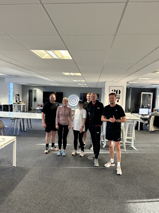
Our culture is in everything we do.
It’s in our passion and dedication. It’s how we nurture our talent. It's the way we behave. It’s how we have fun. It's in our interactions and fostering meaningful relationships and a culture where everyone excels.
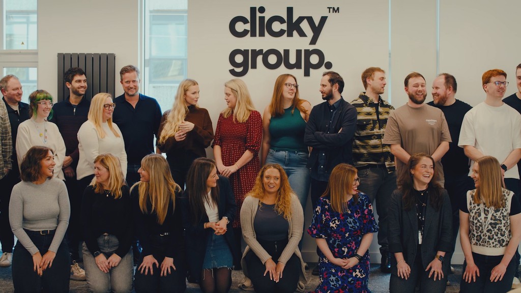
Our team
Leadership team.
Our founding aim, ethos, and what motivates everything we do, is transforming ambitious brands through world-class, results-driven digital strategies, tied to long-term commercial success.


OUR OFFICE
Clicky HQ.
Our 5,000 sq. ft HQ is in the heart of Chester. We also have a team of homeworkers spread across the UK who all contribute to our brilliant collective.
Awards.
Our results, work and team are frequently recognised through awards and we proudly retain our Google Premier, Microsoft Ads and Facebook Partner statuses.
We're highly qualified, at the cutting-edge, truly multi-disciplined, and are officially one of the Top 100 Small Companies to work for in the UK, and also in the Top 40 of Media and Marketing Agencies to work for.


